


The Story So Near Regular font
Publisher
MyFonts.com
License
$ Commercial
Date added
Dec 06 2016
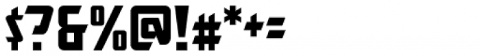
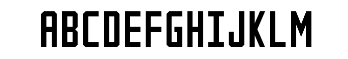
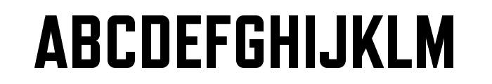
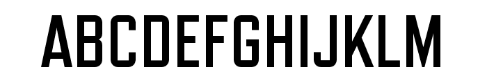
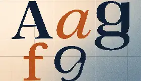
A bold, angular, and geometric font with a modern style.
This font features bold, angular characters with a modern and geometric style. The uppercase letters are particularly striking with sharp edges and a strong presence. The lowercase letters maintain the angular theme, creating a cohesive look. Numbers and special characters are designed to match the bold and geometric aesthetic.
Ideal for headlines, posters, branding, and any project needing a strong, modern aesthetic.
Headlines, Logos, Posters
Balanced
Download The Story So Near Regular font.
Ideal for headlines, posters, branding, and any project needing a strong, modern aesthetic.
Headlines, Logos, Posters
Balanced
Category
Bold
Yes
Italic
No
Weight
Bold
Width
Normal
Character spacing
Normal
Line height
Normal
Contrast
Low
Overall style
Modern
X height
Medium
Cap height
High
$ Free > Personal Use

$ Free > Personal Use
Similar fonts for The Story So Near Regular from Adobe.com
$ Commercial > Adobe.com
$ Commercial > Adobe.com
Similar fonts for The Story So Near Regular from MyFonts.com
$ Commercial > MyFonts.com

$ Commercial > MyFonts.com
Similar fonts for The Story So Near Regular from CreativeMarket.com

$ Commercial > CreativeMarket.com

$ Commercial > CreativeMarket.com
Help your fellow font-seekers if you think you can recognize the font. Earn some good karma by doing it :-) Answer & Help
Yet sometimes the images are very complex, so other users need a bit of help.
If you recognize the font from the samples posted here don't be shy and help a fellow designer.
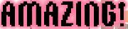
Thousands of designers (famous or not) use the image font detection system to find a font or similar free fonts from an image. Although we have the largest database of fonts, the search for a font from an image gets mixed results like the image above.
Recognize the font? Browse forumHave a font you want to use on the web?
Webfont Generatorin seconds.