Preview Wrong Delivery font with your text


Wrong Delivery font
Publisher
License
$ Free for personal use
Date added
Feb 17 2023
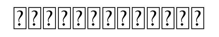
Bold, distressed font with a grunge effect.
This font features a bold, distressed style with a grunge effect, giving it a worn and textured appearance. The uppercase letters and numbers are heavily stylized with irregular patterns that suggest a sense of movement or disruption.
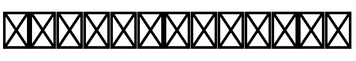
Ideal for edgy designs, music album covers, posters, or any project requiring a bold, impactful statement.
Headlines, Logos
Balanced
Download Wrong Delivery font. Wrong Delivery by Imagex 2021. All Rights Reserved
Ideal for edgy designs, music album covers, posters, or any project requiring a bold, impactful statement.
Headlines, Logos
Balanced
(Fonts by imagex - Personal-use only. For commercial use please contact owner.)
Category
Bold
Yes
Italic
No
Weight
Bold
Width
Normal
Character spacing
Normal
Line height
Normal
Contrast
High
Overall style
Decorative
X height
Medium
Cap height
High
Similar Free Fonts for Wrong Delivery
$ Free > Personal Use

$ Free > Personal Use
Similar fonts for Wrong Delivery from Adobe.com
$ Commercial > Adobe.com

$ Commercial > Adobe.com
Similar fonts for Wrong Delivery from MyFonts.com

$ Commercial > MyFonts.com

$ Commercial > MyFonts.com
Similar fonts for Wrong Delivery from CreativeMarket.com

$ Commercial > CreativeMarket.com

$ Commercial > CreativeMarket.com
Help your fellow font-seekers if you think you can recognize the font. Earn some good karma by doing it :-) Answer & Help

Yet sometimes the images are very complex, so other users need a bit of help.
If you recognize the font from the samples posted here don't be shy and help a fellow designer.
Thousands of designers (famous or not) use the image font detection system to find a font or similar free fonts from an image. Although we have the largest database of fonts, the search for a font from an image gets mixed results like the image above.
Recognize the font? Browse forumHave a font you want to use on the web?
Webfont Generatorin seconds.