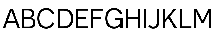
Preview Seismo Club font with your text


Seismo Club font
Publisher
License
$ Free for personal use
Date added
Feb 07 2022
Bold, geometric font with a fragmented, edgy style.
This font features a bold, geometric design with a distinct, fragmented appearance. The characters are constructed with sharp angles and broken lines, giving it a dynamic and edgy look.
Ideal for modern posters, edgy branding, and attention-grabbing headlines.
Headlines, Posters, Branding
Balanced
Download Seismo Club font. Seismo Club by
Ideal for modern posters, edgy branding, and attention-grabbing headlines.
Headlines, Posters, Branding
Balanced
(Fonts by Woodcutter Manero - http://www.woodcutter.es - Personal-use only. For commercial use please contact owner.)
Category
Bold
Yes
Italic
No
Weight
Bold
Width
Normal
Character spacing
Normal
Line height
Normal
Contrast
High
Overall style
Modern, Edgy
X height
Medium
Cap height
High
Similar Free Fonts for Seismo Club
$ Free > Personal Use

$ Free > Personal Use
Similar fonts for Seismo Club from Adobe.com

$ Commercial > Adobe.com
$ Commercial > Adobe.com
Similar fonts for Seismo Club from MyFonts.com

$ Commercial > MyFonts.com

$ Commercial > MyFonts.com
Similar fonts for Seismo Club from CreativeMarket.com

$ Commercial > CreativeMarket.com

$ Commercial > CreativeMarket.com
Help your fellow font-seekers if you think you can recognize the font. Earn some good karma by doing it :-) Answer & Help
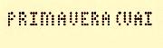
Yet sometimes the images are very complex, so other users need a bit of help.
If you recognize the font from the samples posted here don't be shy and help a fellow designer.
Thousands of designers (famous or not) use the image font detection system to find a font or similar free fonts from an image. Although we have the largest database of fonts, the search for a font from an image gets mixed results like the image above.
Recognize the font? Browse forumHave a font you want to use on the web?
Webfont Generatorin seconds.