Preview Equilibrium font with your text

Equilibrium font
Publisher
License
$ Free for personal use
Date added
Jan 06 2017
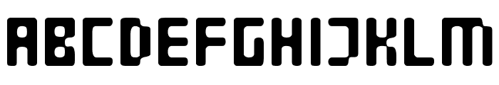
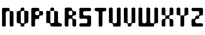
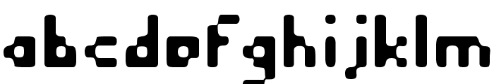
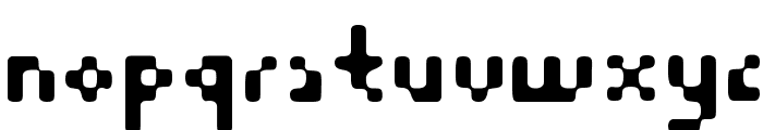
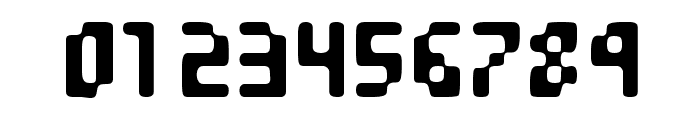
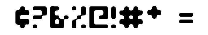
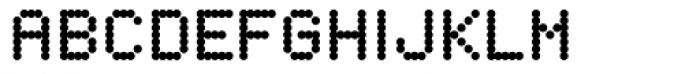
A bold, geometric font with rounded edges and unique cutouts.
This font features a bold, geometric design with rounded edges and a playful, modern aesthetic. The characters are evenly spaced with a consistent stroke width, creating a uniform appearance. The unique cutouts within the letters add a distinctive touch, making it stand out.
Ideal for branding, posters, and modern digital interfaces.
Headlines, Logos
Balanced
Download Equilibrium font. Equilibrium by Equilibrium by Dieznyik / Cheops Fonts -- web.idirect.com/~experts/cheops -- Freeware!
Ideal for branding, posters, and modern digital interfaces.
Headlines, Logos
Balanced
(Fonts by Scott Dieznyik - Kejak (formerly Cheops))
Category
Bold
Yes
Italic
No
Weight
Bold
Width
Normal
Character spacing
Normal
Line height
Normal
Contrast
Low
Overall style
Modern
X height
Medium
Cap height
High
Similar Free Fonts for Equilibrium
$ Free > Personal Use
$ Free > Personal Use
Similar fonts for Equilibrium from Adobe.com
$ Commercial > Adobe.com

$ Commercial > Adobe.com
Similar fonts for Equilibrium from MyFonts.com
$ Commercial > MyFonts.com

$ Commercial > MyFonts.com
Similar fonts for Equilibrium from CreativeMarket.com

$ Commercial > CreativeMarket.com

$ Commercial > CreativeMarket.com
Help your fellow font-seekers if you think you can recognize the font. Earn some good karma by doing it :-) Answer & Help
Yet sometimes the images are very complex, so other users need a bit of help.
If you recognize the font from the samples posted here don't be shy and help a fellow designer.
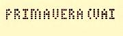
Thousands of designers (famous or not) use the image font detection system to find a font or similar free fonts from an image. Although we have the largest database of fonts, the search for a font from an image gets mixed results like the image above.
Recognize the font? Browse forumHave a font you want to use on the web?
Webfont Generatorin seconds.