Preview Opposit Extra Bold font with your text

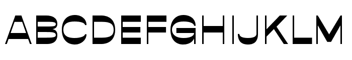
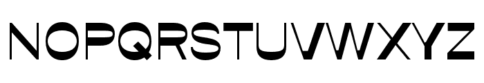
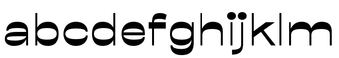
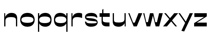
Opposit Extra Bold font
Publisher
goodtypefoundry.com
License
$ Commercial
Date added
Jul 28 2020
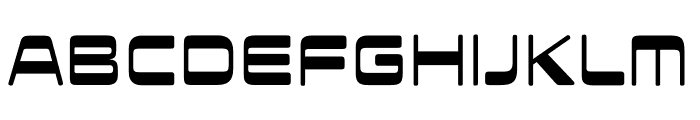
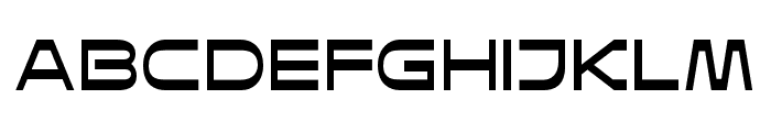
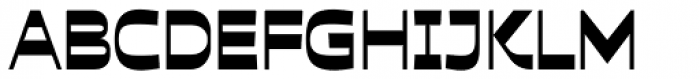
A bold, modern sans-serif font with geometric elements.
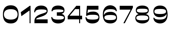
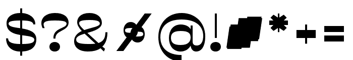
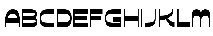
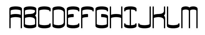
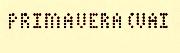
This font features a bold and modern sans-serif style with geometric influences. The characters are clean and minimalistic, with a consistent stroke width that gives it a strong presence. The uppercase letters are slightly wider than the lowercase, and the numerals are proportionate and clear.
Ideal for branding, headlines, posters, and modern web design.
Headlines, Logos
Balanced
Download Opposit Extra Bold font. Opposit Extra Bold by Good Type Foundry
Ideal for branding, headlines, posters, and modern web design.
Headlines, Logos
Balanced
Category
Bold
Yes
Italic
No
Weight
Bold
Width
Normal
Character spacing
Normal
Line height
Normal
Contrast
Low
Overall style
Modern
X height
Medium
Cap height
High
$ Free > Personal Use
$ Free > Personal Use
Similar fonts for Opposit Extra Bold from Adobe.com
$ Commercial > Adobe.com
$ Commercial > Adobe.com
Similar fonts for Opposit Extra Bold from MyFonts.com
$ Commercial > MyFonts.com

$ Commercial > MyFonts.com
Similar fonts for Opposit Extra Bold from CreativeMarket.com

$ Commercial > CreativeMarket.com

$ Commercial > CreativeMarket.com
Help your fellow font-seekers if you think you can recognize the font. Earn some good karma by doing it :-) Answer & Help
Yet sometimes the images are very complex, so other users need a bit of help.
If you recognize the font from the samples posted here don't be shy and help a fellow designer.
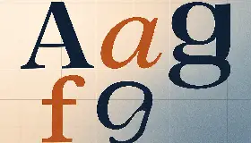
Thousands of designers (famous or not) use the image font detection system to find a font or similar free fonts from an image. Although we have the largest database of fonts, the search for a font from an image gets mixed results like the image above.
Recognize the font? Browse forumHave a font you want to use on the web?
Webfont Generatorin seconds.