Preview The Story So Far & Near Far Regular font with your text


The Story So Far & Near Far Regular font
Publisher
MyFonts.com
License
$ Commercial
Date added
Dec 01 2025
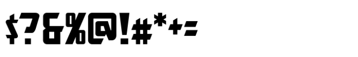
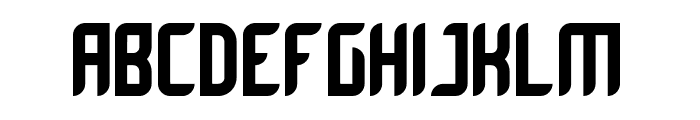
Bold, condensed sans-serif with sharp, angular edges and a modern gothic vibe.
A bold, condensed sans-serif font with sharp, angular edges and a slightly gothic, modern style. The characters have a strong vertical emphasis with narrow widths and consistent stroke thickness. The lowercase letters maintain the angular theme with some unique cuts and slants, especially noticeable in letters like 'g', 'j', and 'k'.
Ideal for headlines, posters, logos, branding, and any design requiring a strong, impactful display font.
Headlines, Logos, Posters
Download The Story So Far & Near Far Regular font.
Ideal for headlines, posters, logos, branding, and any design requiring a strong, impactful display font.
Headlines, Logos, Posters
Category
Bold
Yes
Italic
No
Weight
Bold
Width
Condensed
Character spacing
Normal
Line height
Normal
Contrast
Low
Overall style
Modern, Gothic, Display
X height
Cap height

$ Free > Personal Use
$ Free > Personal Use
Similar fonts for The Story So Far & Near Far Regular from Adobe.com

$ Commercial > Adobe.com

$ Commercial > Adobe.com
Similar fonts for The Story So Far & Near Far Regular from MyFonts.com

$ Commercial > MyFonts.com

$ Commercial > MyFonts.com
Similar fonts for The Story So Far & Near Far Regular from CreativeMarket.com

$ Commercial > CreativeMarket.com

$ Commercial > CreativeMarket.com
Help your fellow font-seekers if you think you can recognize the font. Earn some good karma by doing it :-) Answer & Help
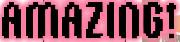
Yet sometimes the images are very complex, so other users need a bit of help.
If you recognize the font from the samples posted here don't be shy and help a fellow designer.
Thousands of designers (famous or not) use the image font detection system to find a font or similar free fonts from an image. Although we have the largest database of fonts, the search for a font from an image gets mixed results like the image above.
Recognize the font? Browse forumHave a font you want to use on the web?
Webfont Generatorin seconds.