Preview Pret A Porter Contrast Thin Ornaments font with your text


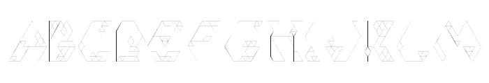
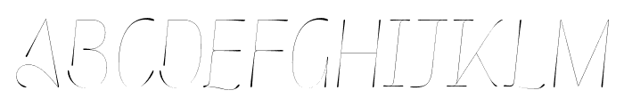
Pret A Porter Contrast Thin Ornaments font
Publisher
FontBros.com
License
$ Commercial
Date added
May 20 2020
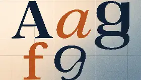
Thin ornamental flourishes and banners with a refined, decorative style.
A collection of thin, elegant ornamental flourishes and banners, featuring delicate swashes and simple outlined or filled ribbon shapes. The lines are consistently fine and smooth, emphasizing a decorative and refined aesthetic.
Wedding invitations, certificates, greeting cards, decorative dividers, branding for luxury goods.
Ornaments, Dividers, Accents, Invitations
Download Pret A Porter Contrast Thin Ornaments font. Pret A Porter Contrast Thin Ornaments by
Wedding invitations, certificates, greeting cards, decorative dividers, branding for luxury goods.
Ornaments, Dividers, Accents, Invitations
Category
Bold
No
Italic
No
Weight
Light
Width
Normal
Character spacing
Normal
Line height
Normal
Contrast
Low
Overall style
Decorative, Elegant, Ornamental
X height
Cap height
Proposed projects
Wedding invitations, certificates, greeting cards, decorative dividers, branding for luxury goods.
Use case
Ornaments, Dividers, Accents, Invitations
Ascender descender ratio

$ Free > Personal Use
$ Free > Personal Use
Similar fonts for Pret A Porter Contrast Thin Ornaments from Adobe.com

$ Commercial > Adobe.com
$ Commercial > Adobe.com
Similar fonts for Pret A Porter Contrast Thin Ornaments from MyFonts.com

$ Commercial > MyFonts.com

$ Commercial > MyFonts.com
Similar fonts for Pret A Porter Contrast Thin Ornaments from CreativeMarket.com

$ Commercial > CreativeMarket.com

$ Commercial > CreativeMarket.com
Help your fellow font-seekers if you think you can recognize the font. Earn some good karma by doing it :-) Answer & Help

Yet sometimes the images are very complex, so other users need a bit of help.
If you recognize the font from the samples posted here don't be shy and help a fellow designer.
Thousands of designers (famous or not) use the image font detection system to find a font or similar free fonts from an image. Although we have the largest database of fonts, the search for a font from an image gets mixed results like the image above.
Recognize the font? Browse forumHave a font you want to use on the web?
Webfont Generatorin seconds.