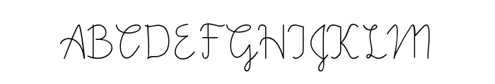
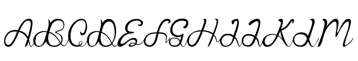
Preview Why Not font with your text

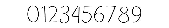
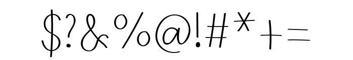
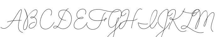
Why Not font
Publisher
Creative Fabrica
License
$ Commercial
Date added
Oct 08 2022
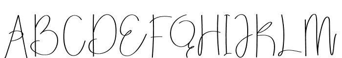
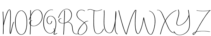
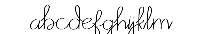
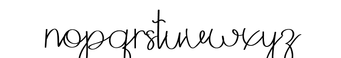
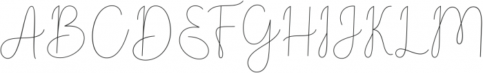
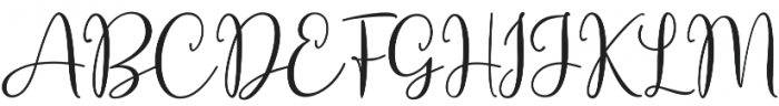
A playful, whimsical handwritten font with thin, flowing strokes.
This font features a playful and whimsical handwritten style with thin, flowing strokes. The characters are elongated and slightly irregular, giving it a casual and artistic appearance. It combines both uppercase and lowercase letters with a consistent stroke width, adding a unique flair to each character.
Ideal for creative projects such as greeting cards, invitations, personal branding, and artistic posters.
Logos, Artistic posters, Invitations
Balanced
Download Why Not font. Why Not by
Ideal for creative projects such as greeting cards, invitations, personal branding, and artistic posters.
Logos, Artistic posters, Invitations
Balanced
Category
Bold
No
Italic
No
Weight
Light
Width
Normal
Character spacing
Normal
Line height
Tall
Contrast
Low
Overall style
Decorative
X height
Medium
Cap height
High
Proposed projects
Ideal for creative projects such as greeting cards, invitations, personal branding, and artistic posters.
Use case
Logos, Artistic posters, Invitations
Ascender descender ratio
Balanced
$ Free > Personal Use
$ Free > Personal Use
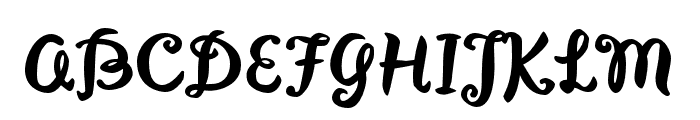
Similar fonts for Why Not from Adobe.com
$ Commercial > Adobe.com
$ Commercial > Adobe.com
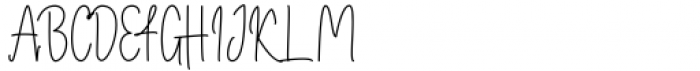
Similar fonts for Why Not from MyFonts.com
$ Commercial > MyFonts.com
$ Commercial > MyFonts.com
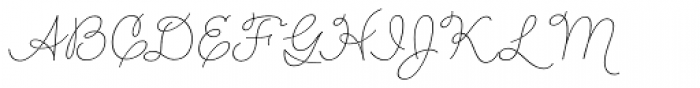
Similar fonts for Why Not from CreativeMarket.com
$ Commercial > CreativeMarket.com
$ Commercial > CreativeMarket.com
Help your fellow font-seekers if you think you can recognize the font. Earn some good karma by doing it :-) Answer & Help
Yet sometimes the images are very complex, so other users need a bit of help.
If you recognize the font from the samples posted here don't be shy and help a fellow designer.
Thousands of designers (famous or not) use the image font detection system to find a font or similar free fonts from an image. Although we have the largest database of fonts, the search for a font from an image gets mixed results like the image above.
Recognize the font? Browse forumHave a font you want to use on the web?
Webfont Generatorin seconds.